HR analysis

IBM data scientists created this fictitional data set to document many job-related characteristics such as employees’ ages, job satisfaction and outcomes like job salaries and attrition. Are there potential relationships between these variables?
Let’s explore.
Distribution of Some Statistics
First, let’s visualize the data by looking at some histograms.
Employee ages
# Employee ages
ggplot(hr_cleaned,aes(x=age))+
  geom_histogram()+
  labs(title = "Distribution of Employee Ages",
       subtitle = "Most number of employees are between age 30 and 35",
       x = "Age", y = "Number of People")+
  theme_igray()+
  theme(title = element_text(size =12,face = "bold"),
        axis.title.x = element_text(size = 10),
        axis.title.y = element_text(size = 10, angle = 90))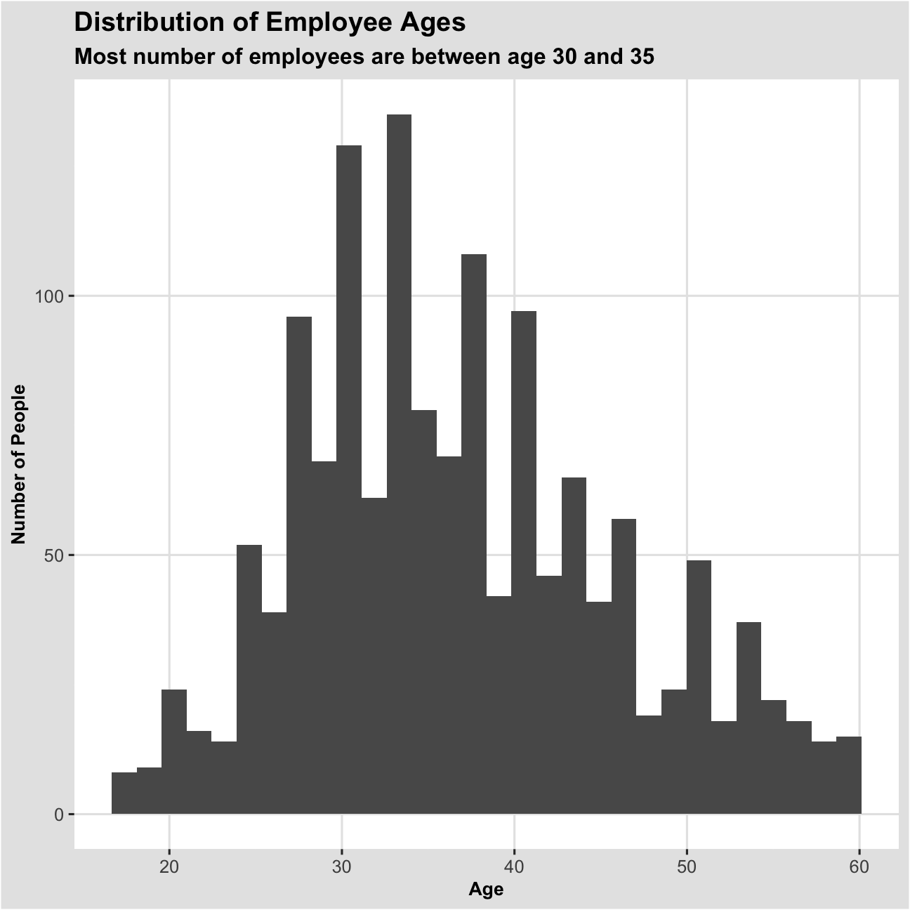
Years worked at company
#Years worked at company
ggplot(hr_cleaned,aes(x=years_at_company))+
  geom_histogram()+
  labs(title = "Distribution of Years Worked at Company",
       subtitle = "A right-skewed distribution shows most employees have worked for very few years",
       x = "Years at Company", y="Number of People")+
  theme_igray()+
  theme(title = element_text(size =12,face = "bold"),
        axis.title.x = element_text(size = 10),
        axis.title.y = element_text(size = 10, angle = 90))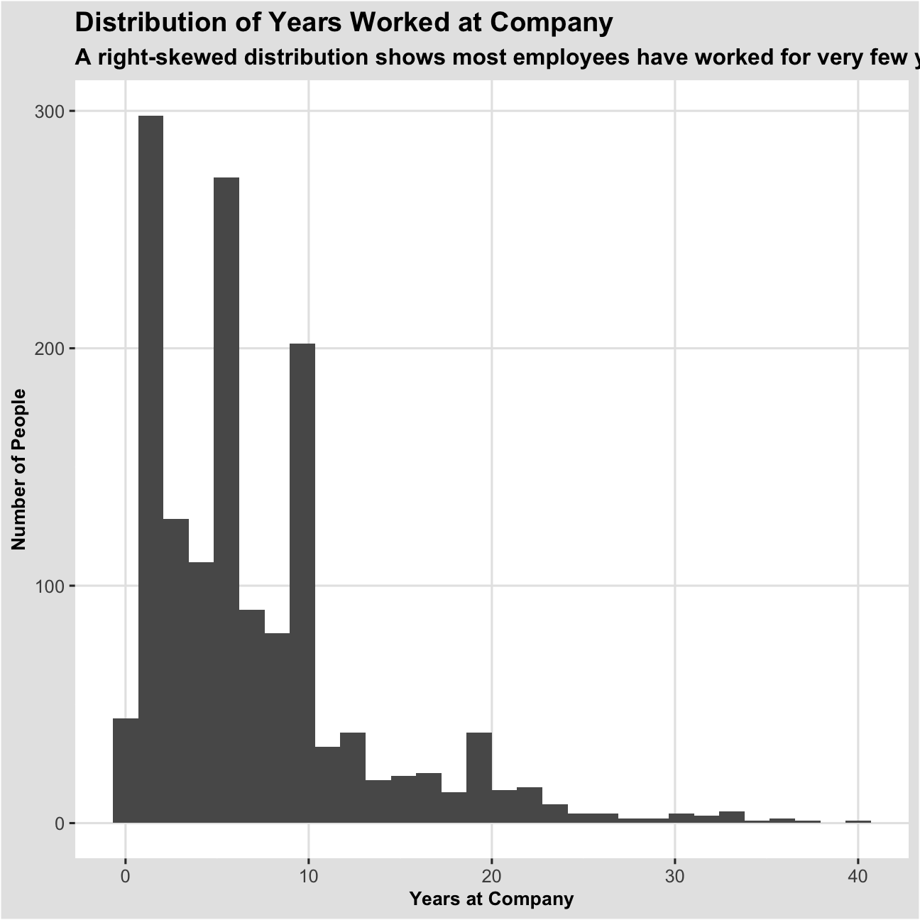
Monthly income
#monthly income
ggplot(hr_cleaned,aes(x=monthly_income))+
  geom_histogram()+
  labs(title="Distribution of Monthly Income",
       subtitle = "Right-skewed distribution : most people are paid less",
       x="Monthly Income", y="Number of People")+
  theme_igray()+
  theme(title = element_text(size =12,face = "bold"),
        axis.title.x = element_text(size = 10),
        axis.title.y = element_text(size = 10, angle = 90))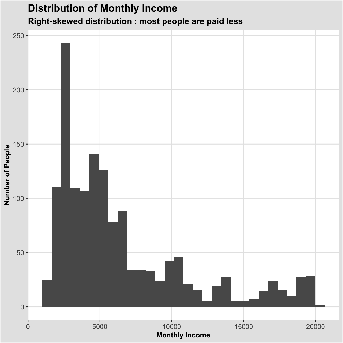
Years since last promotion
#Years since last promotion
ggplot(hr_cleaned,aes(x=years_since_last_promotion))+
  geom_histogram()+
  labs(title="Distribution of Years since Last Promotion",
       subtitle = "Most number of people have not yet been promoted",
       x="Years since Last Promotion",
       y="Number of People")+
  theme_igray()+
  theme(title = element_text(size =12,face = "bold"),
        axis.title.x = element_text(size = 10),
        axis.title.y = element_text(size = 10, angle = 90))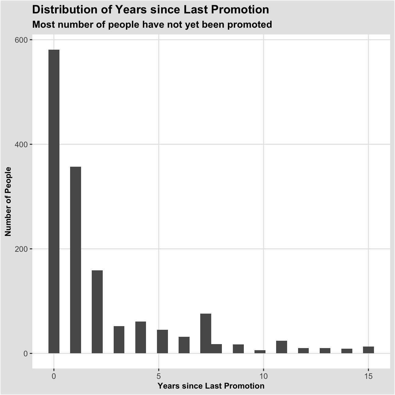
Job satisfaction
p1<- hr_cleaned %>%
  group_by(job_satisfaction)%>%
  summarise(n=n())%>%
  mutate(prop=n/sum(n),
         job_satisfaction = fct_relevel(job_satisfaction,"Very High", "High", "Medium", "Low"))

#job satisfaction
ggplot(p1, aes(x="",y=prop, fill = job_satisfaction))+
         geom_bar(stat="identity",width =1)+
  coord_polar("y", start =0)+
  labs(title = "Proportions of Job Satisfaction",
       subtitle = "The majority of people have high job satisfactions")+
  scale_fill_grey()+
  theme(title = element_text (size = 12),
        axis.text.x = element_blank(),
        axis.title.x = element_blank(),
        axis.title.y = element_blank())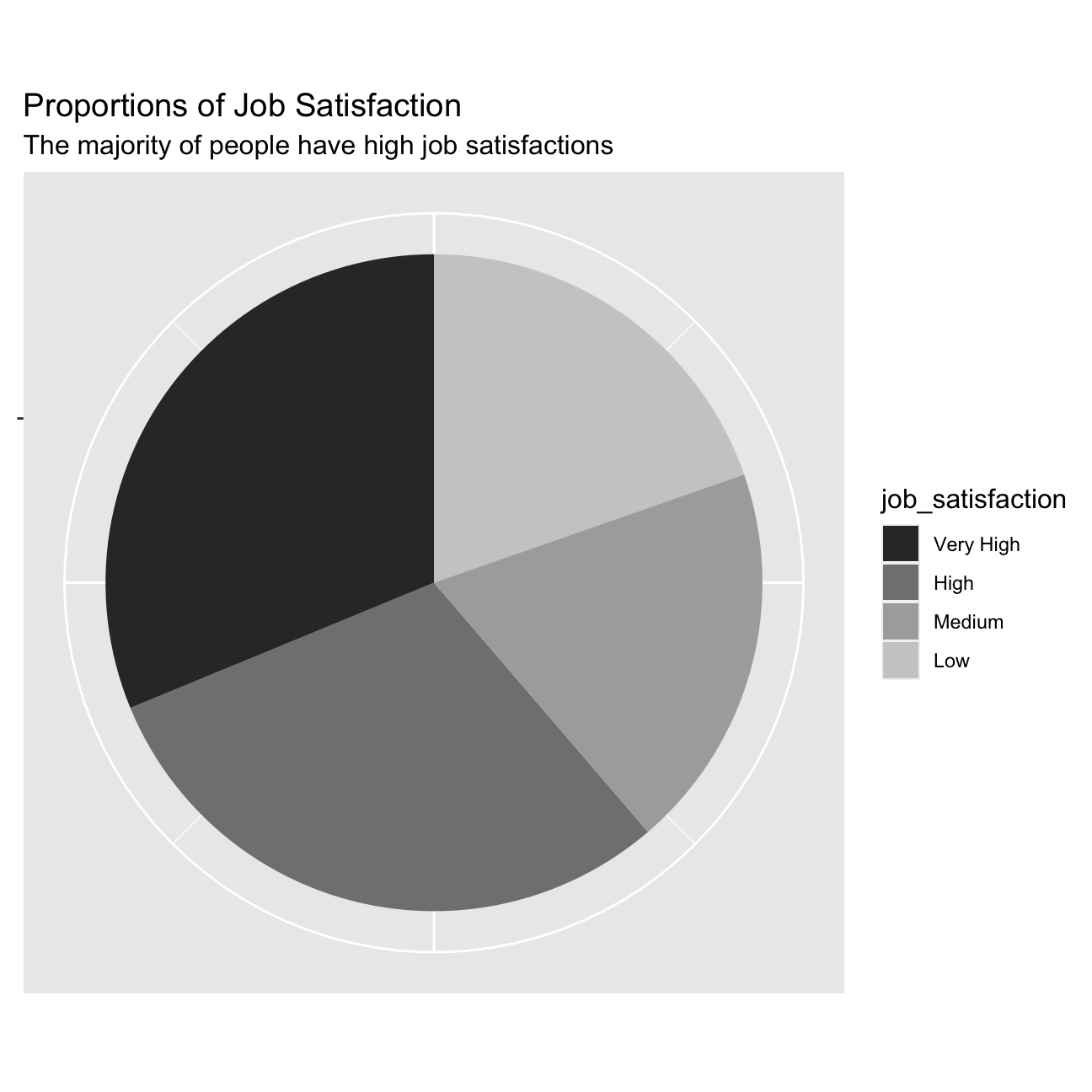
Relationship between variables
Income by gender
ggplot(hr_cleaned, aes(x=reorder(gender,-monthly_income),y=monthly_income))+
  geom_boxplot()+
  labs(title = "Boxplot of Monthly Income for Men and Women",
       subtitle = "Both genders have almost equal income distribution",
       x = "Gender", y="Monthly Income")+
  theme_igray()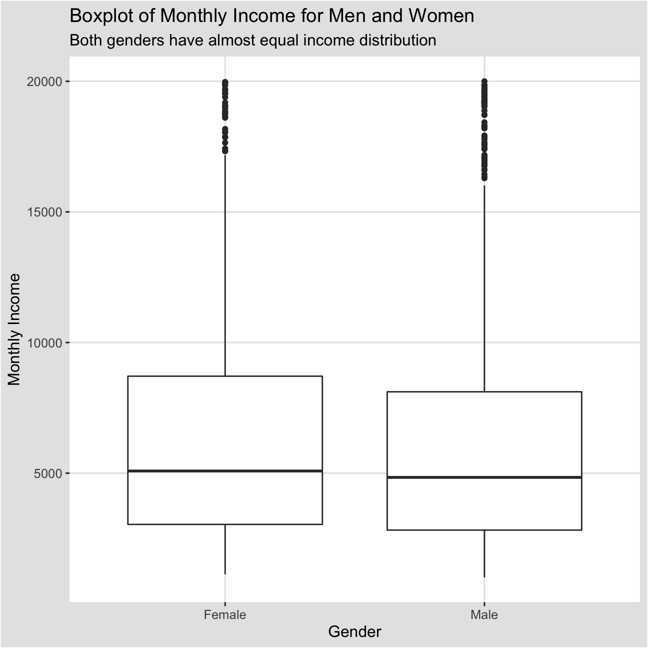
Are we progressing toward equal pay between the two genders? Perhaps. The graph shows that men and women have almost the same income distribution in the form of a boxplot.But men seem to have more outliers that are greater than 1.5*IQR.
Monthly income by job role
ggplot(hr_cleaned, aes(x=reorder(job_role,-monthly_income),y=monthly_income))+
  geom_boxplot()+
  labs(title = "Boxplot of Monthly Income for Each Job Role",
       subtitle = "Managers earn the highest income, while sales representatives earn the lowest ",
       x = "Job Roles", y="Monthly Income")+
  theme_igray()+
  theme(axis.text.x = element_text(angle = 30, size = 5))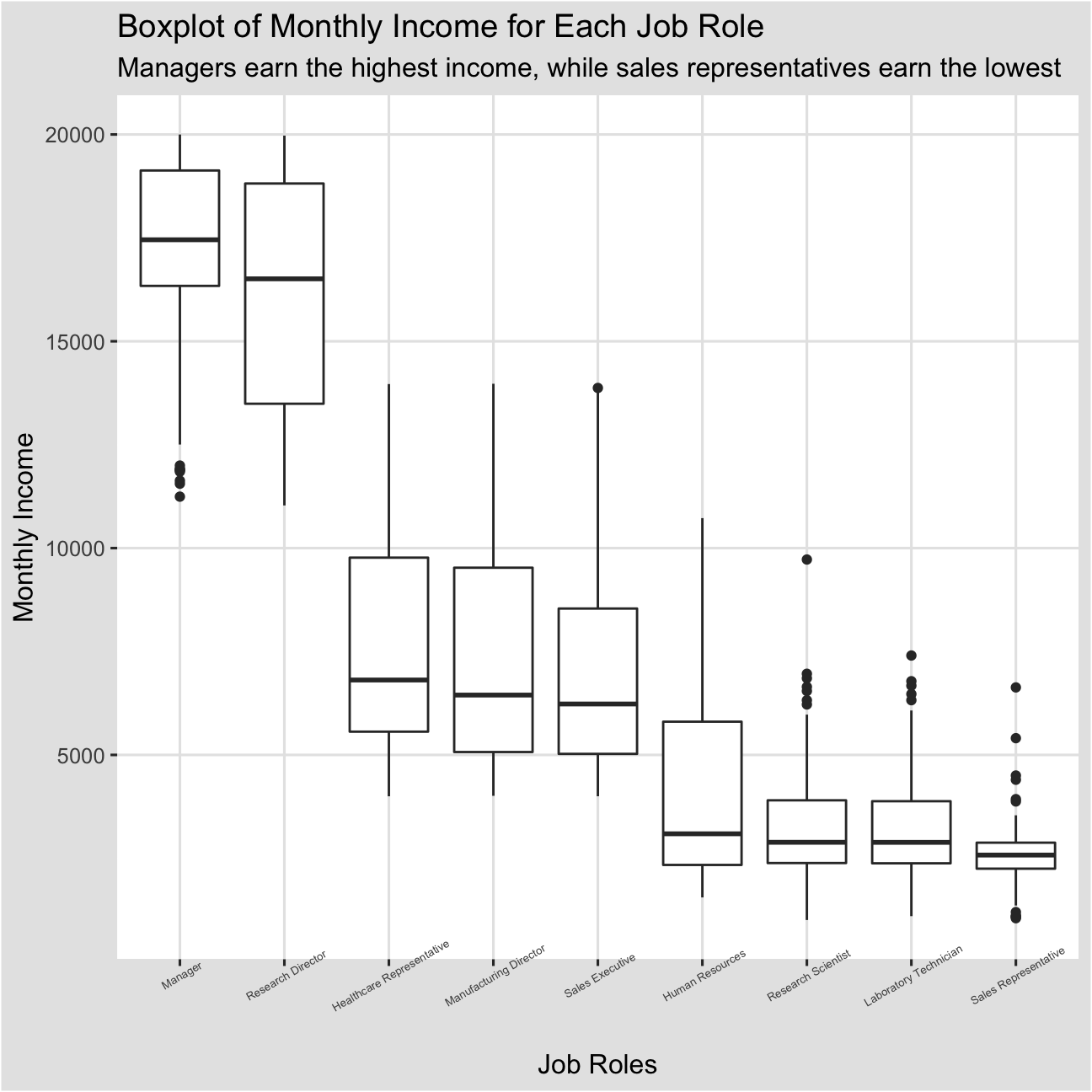
Monthly income can greatly vary from one job role to another. Looking at the boxplot below, managers and research directors earn the highest income, while lab technicians and sales representatives tend to be on the low end. However, for job roles that are located on the lower end, there are several outliers who earn much more than the median income level.
Income faceted by education level
ggplot(hr_cleaned, aes(x=monthly_income))+
  geom_histogram()+
  facet_wrap(~education)+
  theme_igray()+
  labs(title = "Distribution of Income by Education Level",
       subtitle = "All education levels follow a right-skewed distribution",
       x= "Monthly Income", y = "Number of People")+
  theme(axis.text.x = element_text(angle = 30, size = 5))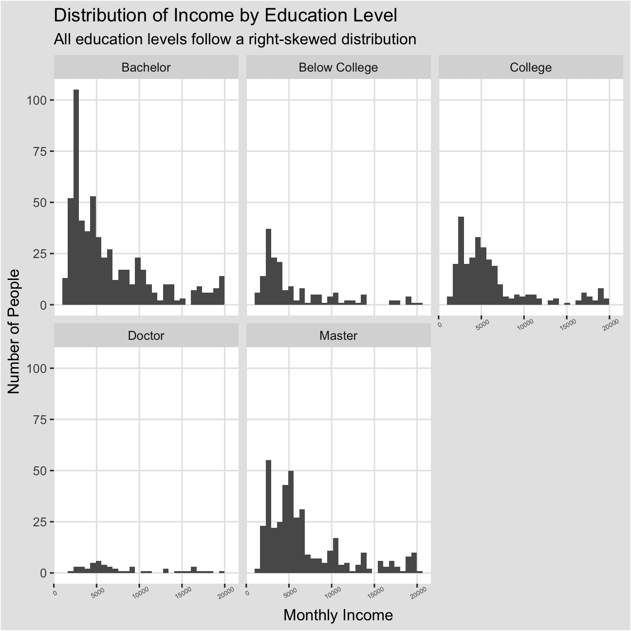
We can see that doctors have the least number of people. Almost all education levels follow a right-skewed distribution, meaning that regardless of their education level, the majority of them still earn less income below 100,000.
Income vs. Age, faceted by Job role
ggplot(hr_cleaned, aes(x=age, y=monthly_income))+
  geom_bar(stat = "identity")+
  facet_wrap(~job_role)+
  theme_igray()+
  labs(title = "Distribution of Income by Age",
       subtitle = "Managers tend to be older",
       x= "Age", y = "Income")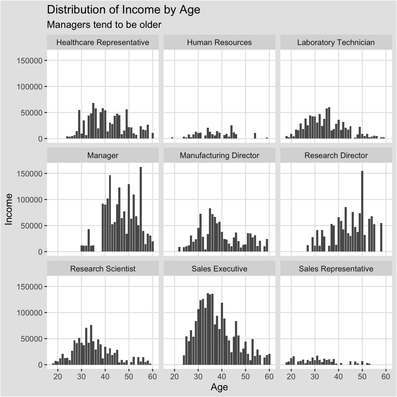
Managers and research directors tend to be older, as they exhibit left-skewed distributions.